Viragoes
What is Viragoes?: Viragoes is a digital vending machine company dedicated to providing quality period products. The brand’s mission is to implement a machine in every sport stadium, airport, and public space.
The Problem: People who menstruate need a more flexible and reliable way to access period products to meet their needs on-the-go.
Approach
My role: UX Research & Design, UI Design
Team: Myself and Ellen Free, Hiba Jaafari, and Connie Do
Timeline: 3 Weeks, Remote
Disclaimer: Sport team mockups were designed as examples and are not affiliated.

Our goal:
- We were tasked with creating a solid research foundation for the founder of Viragoes to present in front of her own clients and prospective business partners in a B2B setting.
- We also had to narrow down the scope to focus on the interface for the existing version of the vending machine.
- We also wanted to provide an accessible and flexible purchase flow for period products through the vending machine, as the current interface was not streamlined for multiple product options.
DISCOVER
Methodologies: Surveys, Affinity Map, User Interviews, Empathy and Experience Map, Competitor Analysis, Retrospective Heuristics & User Flow.
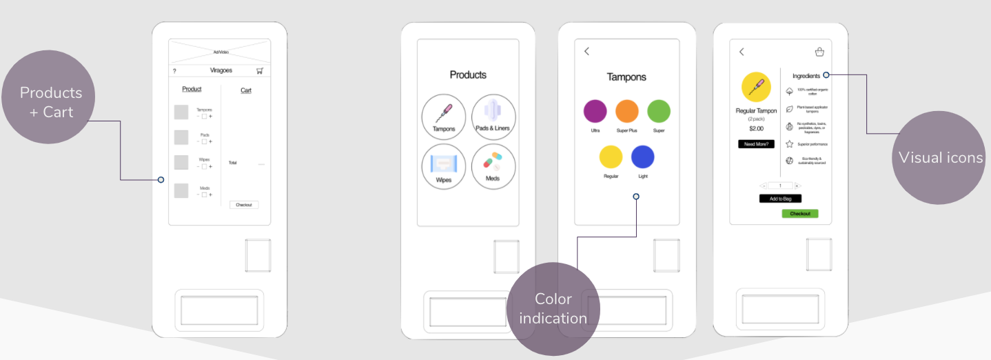
I conducted a heuristic analysis of the current screens for the Viragoes vending machine in order to find areas of opportunity. This highlighted the pain point that a user would have to repeat a full checkout process in order to receive more than one item.

I then created two surveys to understand how (and even if!) people interacted with the existing manual dispensers found in bathrooms.
Survey Goals:
- How were the current period product dispensers meeting menstruation needs?
- How often were these current dispensers stocked, available, or interacted with?

We discovered after receiving 50+ responses:
- Users were unable to access these dispensers because they were broken, never stocked, did not carry any change, or just unavailable.
- Users were stuck resorting to last minute solutions after not having a successful experience.
- That included: using toilet paper, borrowing from a friend or stranger, or buying “overpriced” products within an airport or stadium store.
In addition to this, we conducted 4 user interviews with women of different ages to understand what their experiences were.
“I’m frustrated by companies and public spaces that fail to consider the needs of women.”
Using open comments from our surveys and findings from our interviews, we created an Empathy Map in order to truly understand the user’s pain and separated it into what they said, thought, did, and felt.

There were two main perceptions:
- Difficulty accessing quality period products.
- A disregard for women and menstruating specific needs in the restroom and lack of design consideration.
DEFINE
Methodologies: User Personas, Problem Statement, How Might We?
We created two personas in order to take into consideration their pain points and similar goals they would have during their journey. By creating these two women, we could identify specific needs they would encounter. Also, we combined the data from the interviews and our empathy map to create our user journey map.

We wanted to highlight not only what a person who menstruates went through to find a solution for their period needs, but to find opportunities for the current Viragoes vending machine that would match the user’s wants and needs. We also wanted to convey how a person who menstruate’s journey was filled with far too much anxiety.

With Nicole in mind, we created our problem statement.
People who menstruate need a more flexible and reliable way to access period products to meet their needs on-the-go.
DESIGN
By holding a design studio, we did rapid ideation before moving into wireframing.
There were a few things to keep in mind for Viragoes:
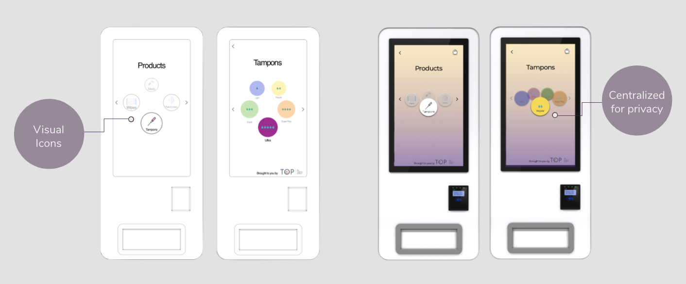
- The owner wanted to target women in sporting stadiums, so we designed based on what a user would see within a venue (such as Staples Center).
- By keeping the colors matching the recognizable sports teams, it would allow the user privacy and efficiency without standing out.
With our greyscale wireframe, I created a prototype that we could begin to test with users. I gave our testers a task, and kept a goal in mind for our persona.
Task: Show me how you would buy one regular tampon and two moderate pads.
Goal: Finish within 2 minutes.
Usability Test Results:

Between the five users, the average completion time was 1 minute and 24 seconds.
The average error rate was only 2 wrong taps.
Taking in our testing feedback, we iterated on the wireframes and created a high fidelity prototype that would allow the client to imagine what the Vending Machine would look like in a stadium setting. We iterated on the feedback from our testers about how they wanted an easier way to get back to all products instead of just the weights for the same product, as well as buy single items instead of packages of two (which were in the original vending machine).

SERVICE DESIGN
We implemented service design into our next steps in order to further research how the machine would be the most impactful when placed within a stadium setting. A selling factor for the machine was that the interface itself was customizable, so we iterated to show what it would look like within different sport stadiums, using the Los Angeles Lakers as our example.

NEXT STEPS
Our next steps would be to implement brand strategy for the implementation phases of the vending machines.
I also want to work on inclusivity. Not everyone who menstruates identifies as a woman, so where would these machines be best located?
I would want to further iterate on QR landing pages or a mobile app.