Forward Health
What is Forward?: Forward Healthcare is preventative healthcare that starts at home. They’re an all-inclusive, advanced doctor’s office that offers in clinic visits or virtual visits.
The Problem: Forward patients need an efficient way to access and schedule their appointments because they want to feel more in control of their healthcare.
Approach
My role: UX Research & Design, UI Design
Team: Myself and 3 others
Timeline: 2 Weeks
DISCOVER
My team and I were given a task to solve a problem for this company with no other context except the name and the vision for the client. Keeping this in mind, I considered three main research questions and areas that we could answer.
- What are the healthcare needs for the user?
- Create a persona that will guide our design decisions and improve the user experience on Forward’s application.
- Ensure that the app remains empathetic, as healthcare is a very personal subject.
In the first stage of our research, we chose to pursue a Comparative and Competitive analysis to see what features Forward offered with those within their industry and on the outside.

By creating this C&C, we could quickly see that Forward (last column) had opportunities for growth to:
- create appointments through the app
- check for all health information immediately
- discover the closest clinic or urgent care
Since we did not have access to Forward's users, I suggested looking into the reviews left on the iphone app store.
Combining these reviews with user interviews, we created an affinity map to see user's pain points.

We found:
- users want to schedule appointments by themselves
- users want to have a place with all their health records
- users like a consistent communication line
DEFINE
By synthesizing our research, I created our primary persona to embody the user’s paint points and goals that would help guide our design decisions moving forward.

Keeping Chloe in mind, we created three statements to help lead us into the design phase:
- How might we help Chloe access her medical records efficiently from her phone?
- How might we provide multiple options to schedule appointments?
- How might we implement multiple communication options with her doctor?
By creating a User Flow, it helped us focus on the path of virtual visits and self-sufficiency.

DESIGN
We conducted a design studio to ideate different possible screens for our persona’s problem.
We wanted to ensure a collaboration of ideas to hit all possible iterations of solutions.
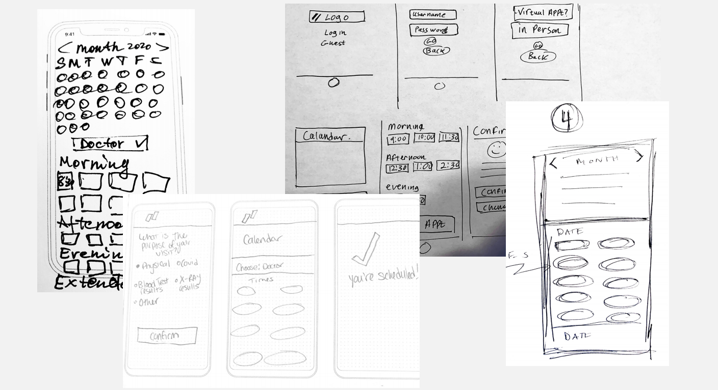
I then moved on to the "reason for visiting" screens, mocking them up in a greyscale version to add variation and see what could be improved upon.

We then created a clickable prototype to test with our users.
The task for our user was to schedule a virtual visit using Forward’s app with minimal errors.
Using our clickable prototype, we conducted four moderated tests. Two in person, and two remote.
Test results.
Since this was the first avenue of scheduling, we measured that a user could complete the task in:
- average of 4 minutes
- average of 7 clicks
What went wrong.
- users did not like the distractions on the home page of the app.
- there were the same features twice on the home page that caused confusion.
What I learned:
Teamwork and collaboration is difficult to navigate in the beginning of a project. In a team setting, it’s important to ensure everyone’s voice feels heard, and everyone has a chance to bring ideas forward to the table. Once we worked out our different working habits and abilities, we were able to combine our UX abilities into creating a product that remained empathetic and for the user.
What I would do differently:
Looking back, I would have liked to create a more structured team plan for my group. I believe it would have let us iterate further on our deliverables, as well as create a more in-depth experience if we had more time to test and create new ideas based on testing.
I would also like to test the wireframes I created with an Onboarding Flow and an Ipad Design, since Forward currently does not have one.

I really challenged myself with the User Interface design, and I believe it stayed true to the clean and clear branding of Forward healthcare.


