Cricket Health
What is Cricket Health?: Cricket Health was dedicated to helping their members navigate their Chronic Kidney Disease (Stages 3 to End Stage) by connecting them with a Care Team to supplement them between Doctor visits.
The Appointment Conundrum
The Problem: Cricket Care Team members, which consisted of Registered Nurses (RN), Social Workers (SW), and Dietitians, would run into the issue of being unable to complete an appointment with a patient within 30 days of their onboarding.
Goal: Achieve 60% completion of scheduled appointments within 30 days.
How might we create a simple, reliable way for members to view, manage, and act on their upcoming appointments?
DISCOVER
Methodologies: User Interviews, Affinity Mapping
Through our user interviews, I focused on several patterns that would help drive our design within our patient portal.
- Members often write appointment details on paper, which can be easily lost or forgotten.
- There is limited clarity around appointment details, such as provider information or contact methods.
- Rescheduling or canceling requires extra effort, often involving looking for phone numbers.
- Members expressed a desire for a single, trustworthy source of truth, such as the nurse, to avoid waiting on hold.
Using affinity mapping, I synthesized these insights into key themes to follow for our design:
- Clear visibility will most likely reduce anxiety in our older population.
- Convenience increases their follow up and adherence to appointments.
- Direct action (like calling the nurse) removes the frustration around understanding what's next.
DEFINE
I focused on a few themes to ensure we covered what was possible and within scope of our patient platform:
- View upcoming appointment dates and times, and be able to add directly to a calenaer, mobile or desktop.
- See assigned nurse details.
- Offer the direct phone line for patients to call if they wished to make changes.
- Cancel appointments without navigating away.
The design focused on clarity, accessibility, and minimizing cognitive load.
DESIGN
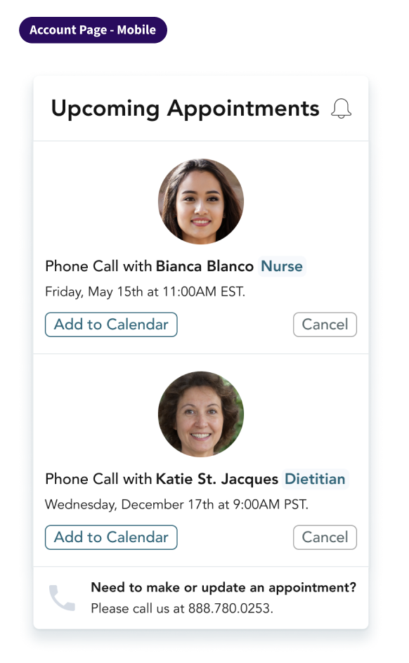
Our patient portal had four tabs within its navigation. One was called Me, for patient information and settings. I updated this page to include the appointments, which would notify them along the navigation with an alert that there was something new on the page.
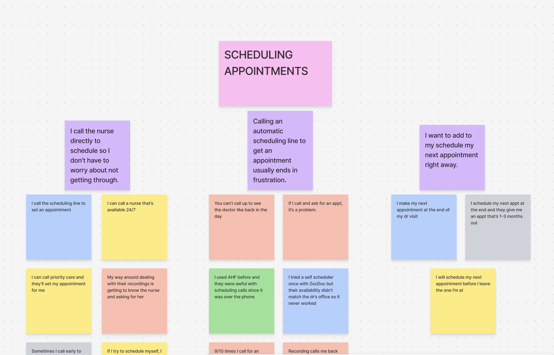
To begin, I focused on the empty state, matching the theme of having little cognitive load, but still prompting them to contact us and create an appointment if they needed to speak with any member of their care team.
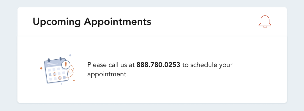
After this, I moved on to what it would look like if the patient had multiple upcoming appointments.
MyCricket had both a desktop and a mobile site, so they had to stack cleanly and not clutter the minimum screen space that would be available. The information most important to the patient was provided, which was the name of the Care Team Member, the date, and their role. Other information included the option to add to calendar, or cancel the appointment directly themselves. This would free up our Care Team members from waiting for no shows and be able to attend other appointments.
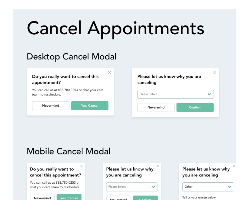
And lastly, a pop up modal that would ask them why they were canceling and prompt on the backend for one of our Care Coordinators to reach out and reschedule the appointment.
User Testing
With a group of five individuals aged 65+, we had them view the home page, navigate to where they thought appointments would be, and give feedback on what they saw.
- All understood who they would have an appointment with an when.
- One user had trouble understanding why the cancel button was available.
- Users appreciated all the visibility, the phone number to direct them to contact someone about this specifically, and the ability to add to their calendar.
Outcomes
- Increased visibility of appointments in a centralized location.
- Enabled faster communication through direct calling to our Care Team.
- Improved overall member confidence and engagement.
Goal & Impact
Goal: Achieve a 60% completion rate of scheduled appointments within 30 days.
By reducing friction and improving access to key information, this solution directly supported higher appointment adherence and better health outcomes for our members.
Next Steps
This project reinforced the importance of designing for our older population's behaviors rather than ideal workflows. By meeting users where they are, as is important when dealing with less tech inclined individuals, we were able to create a solution that is both practical and impactful.
Future iterations could explore deeper integrations, such as automated reminders, calendar syncing, or direct messages to further improve our goal.